02. Commitment
03. Location
04. Formats
05. Program
06. F.A.Q.
Alt Type Production ©
2021-2026
@alt__tf
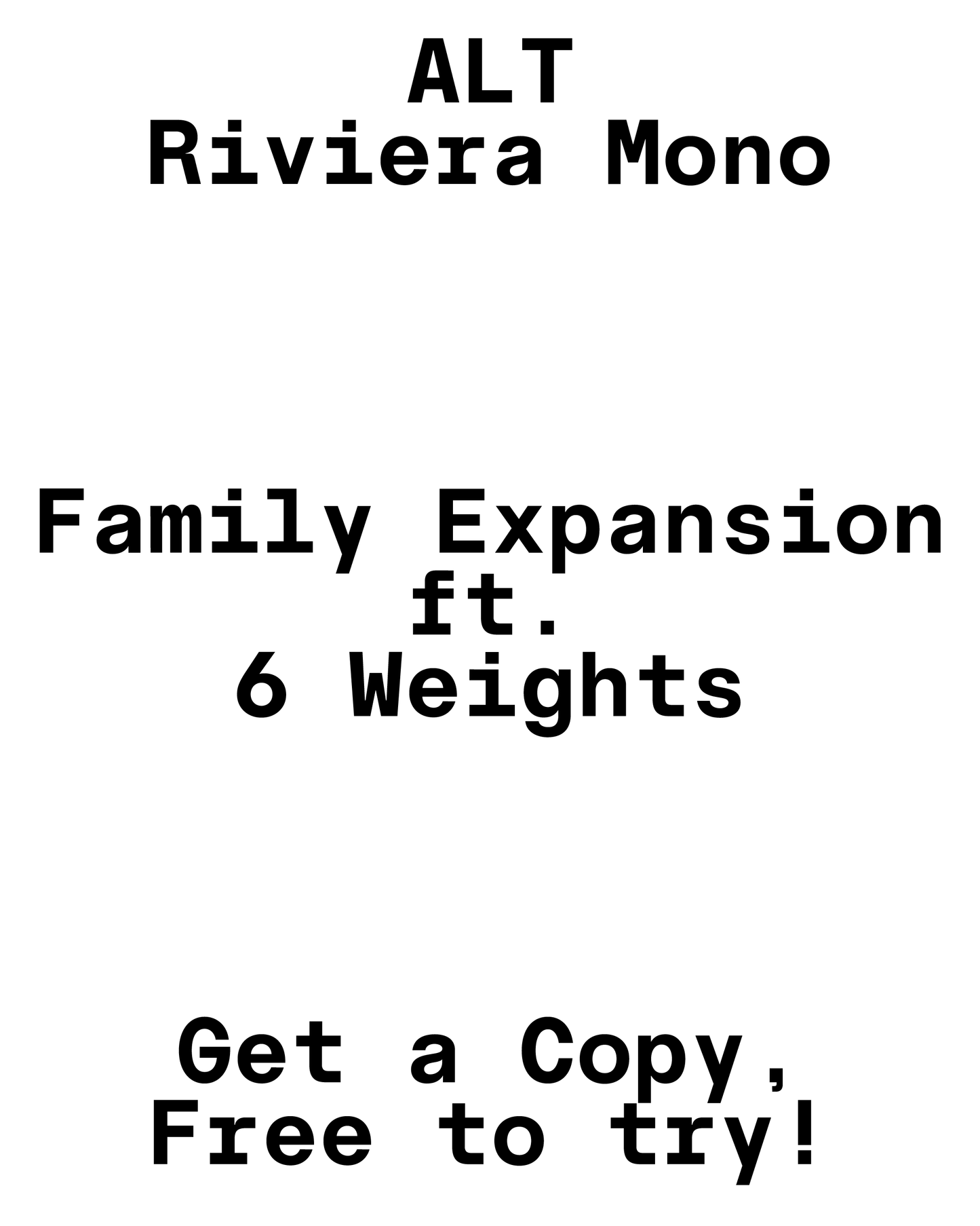
ALT Riviera Mono distils the character of Riviera into a fixed-width system without sanding off its personality. It’s a contemporary monospaced grotesk that prioritises clarity and rhythm, while still carrying the subtle irregularities that define the family.
Built on the same geometric logic as the proportional styles, Riviera Mono avoids the sterile feel common to monospaced type. Curves retain their slight asymmetries, joins stay intentional, and certain letters hold onto their tension points — giving the font a steady pulse even within strict spacing constraints.
A mono that feels controlled but not mechanical, functional without being anonymous.
Designed for environments where alignment and consistency matter — code, data, interfaces, tables, editorial systems — Riviera Mono also holds up beyond purely technical contexts. Confident proportions, disciplined contrast, and small moments of attitude allow it to step forward when needed, without breaking its rhythm.
FEATURES:
— 600+ glyphs
— 6 font weights + italics + monospaced
— Uppercase, lowercase, numerals, punctuation
— Diacritics
— Symbols
— Mathematical symbols (Roman numerals, fractions, signs)
— Western, Central, South and North Latin language support
— Latin Extended A (100%)
— Latin Extended B (13%)
— Greek


ALT Riviera Mono in Use
We love seeing our fonts out in the wild, it is both a great way to keep an archive and to give back to the amazing designers creating great work. If you used one of our typefaces in a personal or commercial project, we'd love to see it. Send us an email with some images and a brief project description.
- Choosing a selection results in a full page refresh.
- Opens in a new window.