02. Commitment
03. Location
04. Formats
05. Program
06. F.A.Q.
Alt Type Production ©
2021-2026
@alt__tf
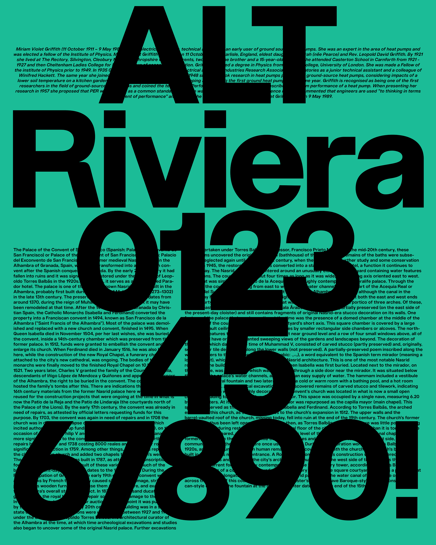
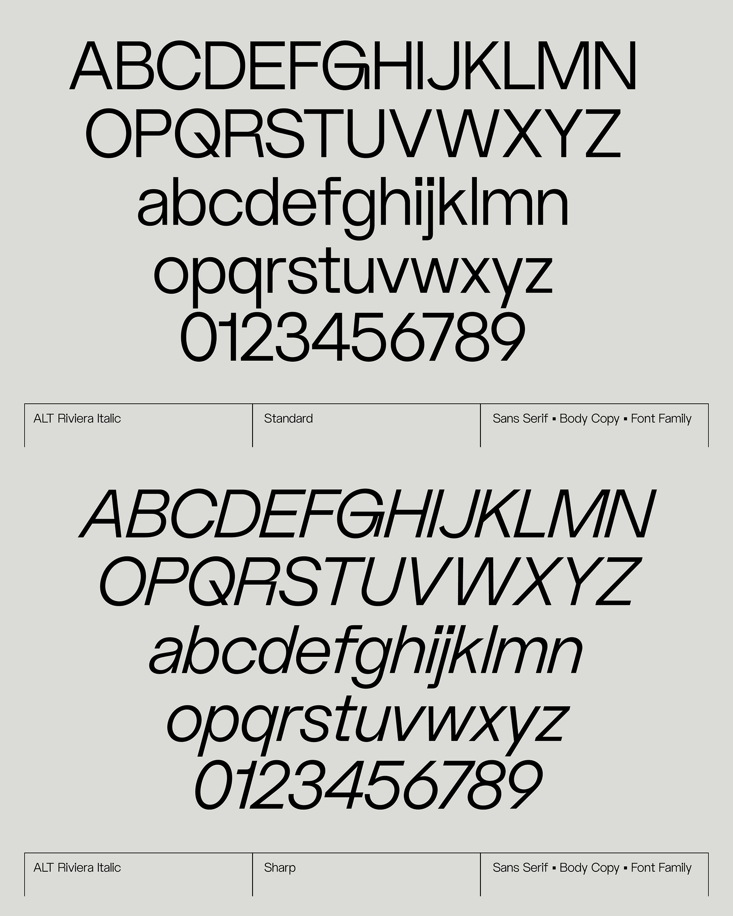
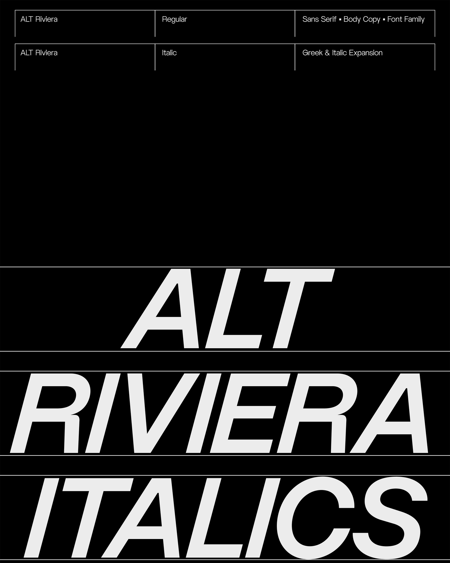
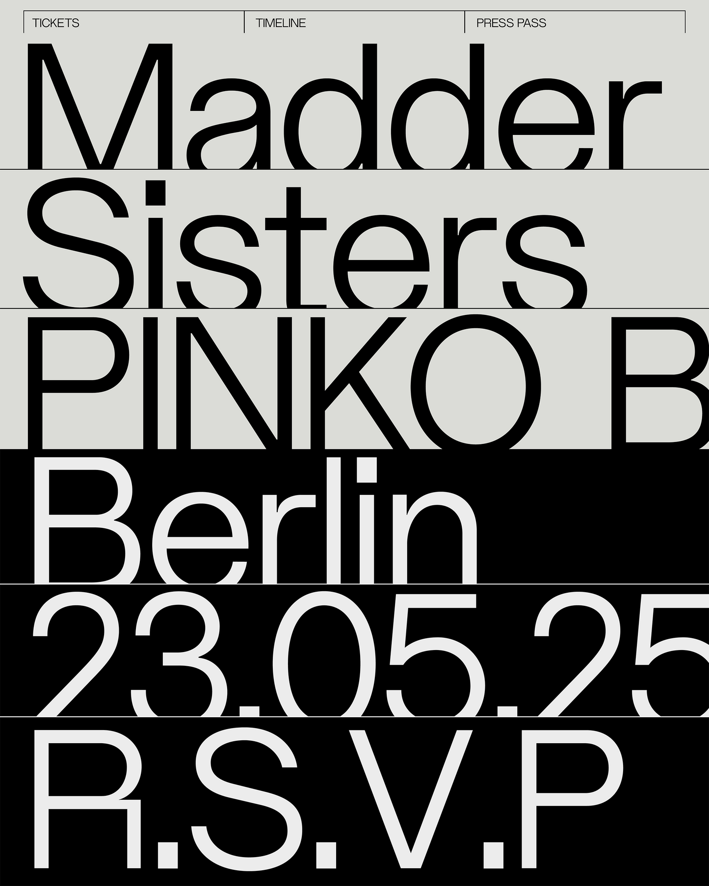
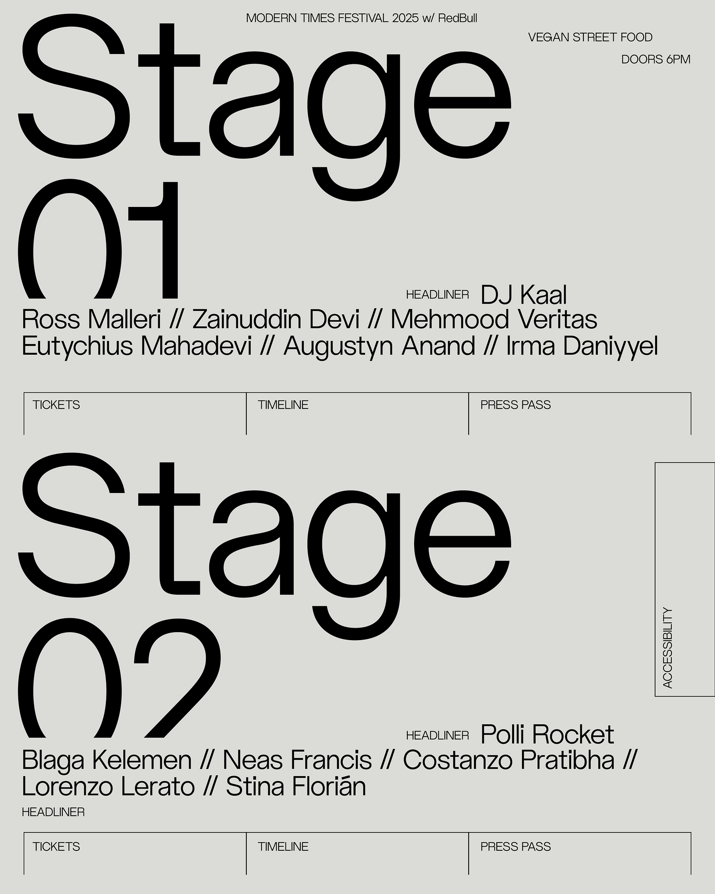
ALT Riviera is a contemporary grotesk that doesn’t pretend to be neutral; it sits comfortably in the modern sans-serif scene: clean, functional and usable. But the closer you look at it, the more it refuses to be anonymous. The construction borrows from geometric logic, but the shapes aren’t rigid or sanitized.
Curves are occasionally slightly off, joins feel considered, and certain letters carry tension points that give the font a pulse. What makes Riviera work is the balance between control and looseness, soft and sharp. It works well in text, but it has moments where it can step forward: an R that feels confident, a G with attitude, proportions that don’t fully conform to neutrality.
These details keep it from feeling too boring or generic, without tipping into gimmick territory. Expressive, but disciplined.
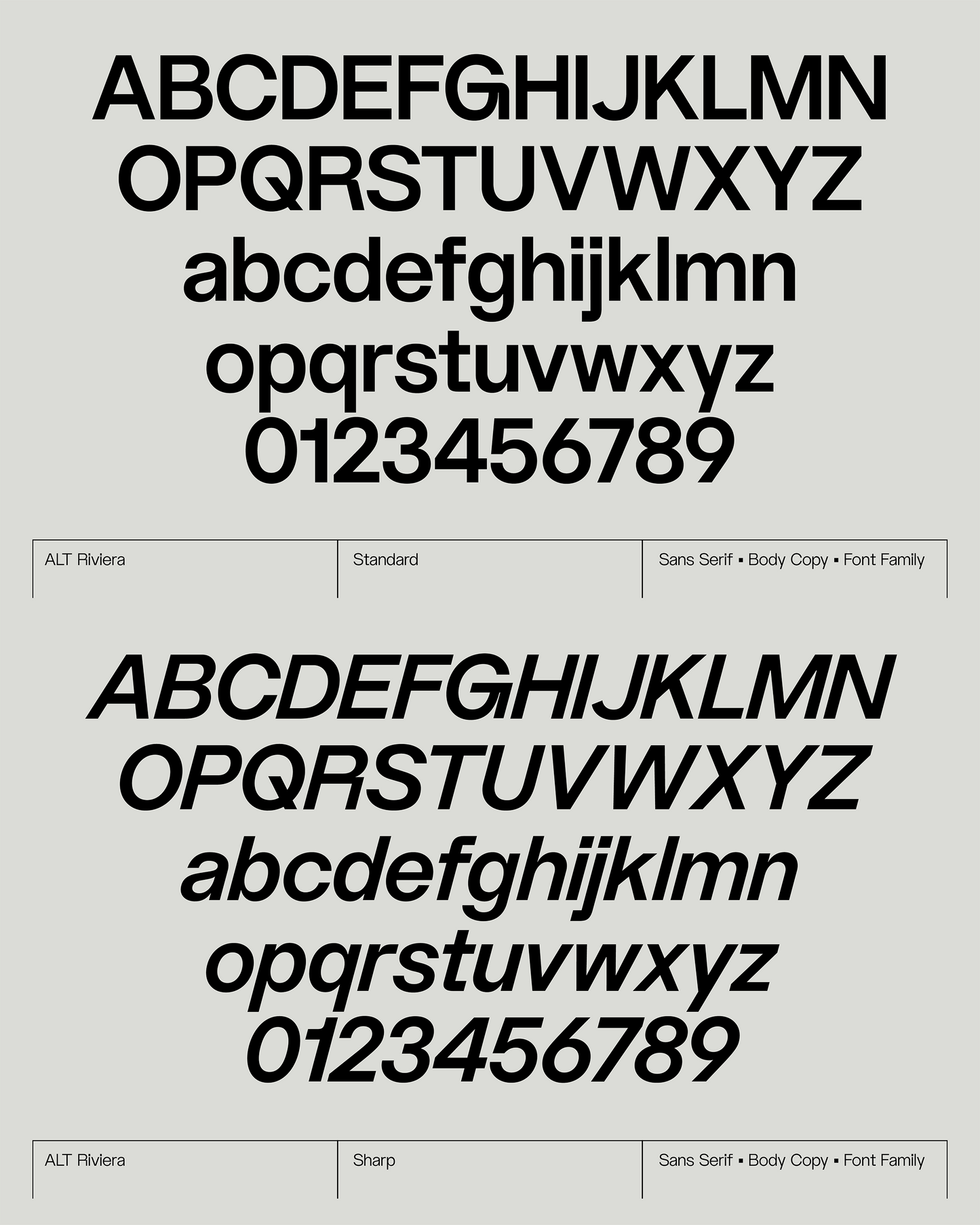
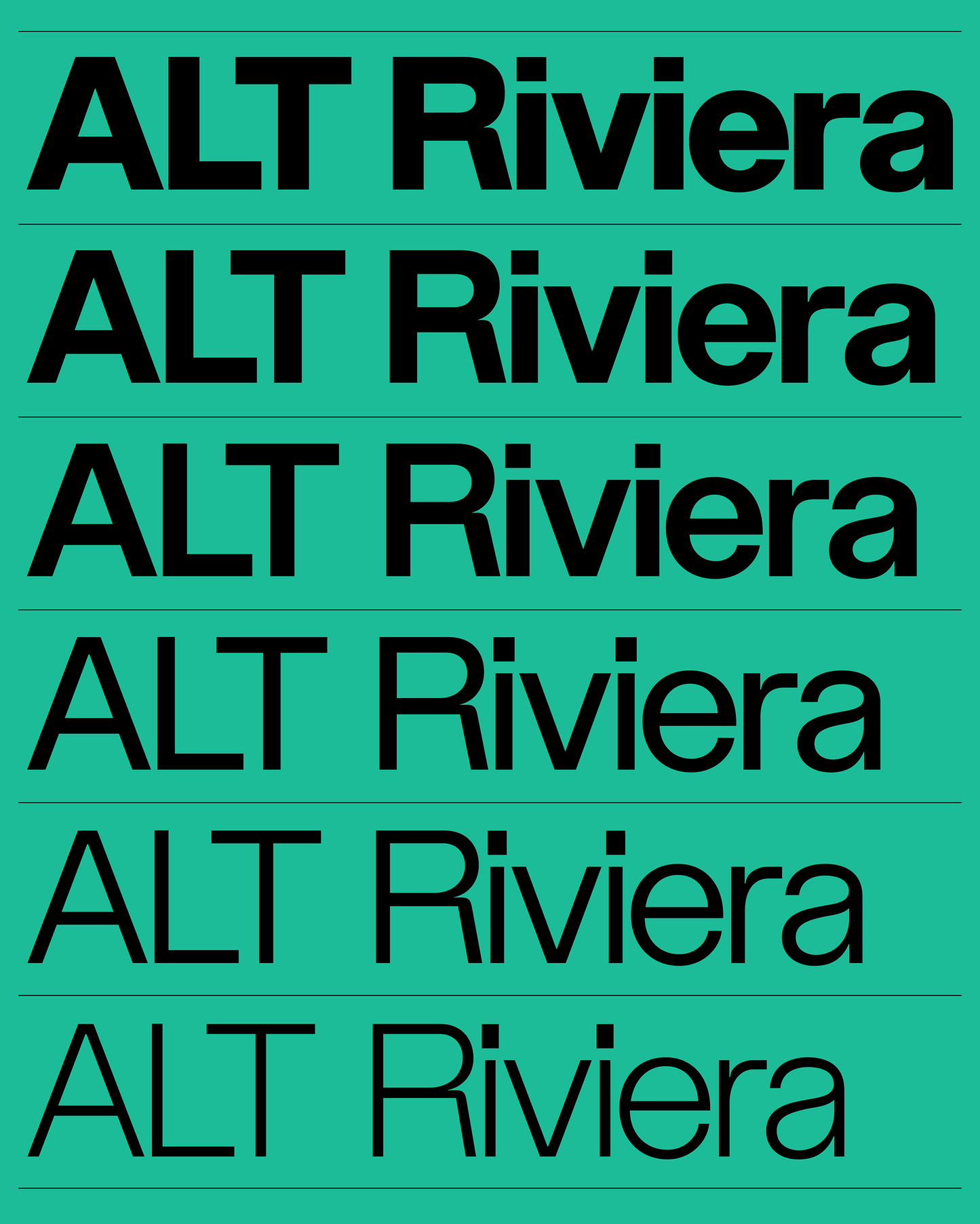
Equipped with 6 font weights (Extralight, Light, Regular, Medium, Bold and Extrabold) and it's accompanying italic and monospaced cuts, ALT Riviera packs a punch, suitable for both Display and Text scenarios.
FEATURES:
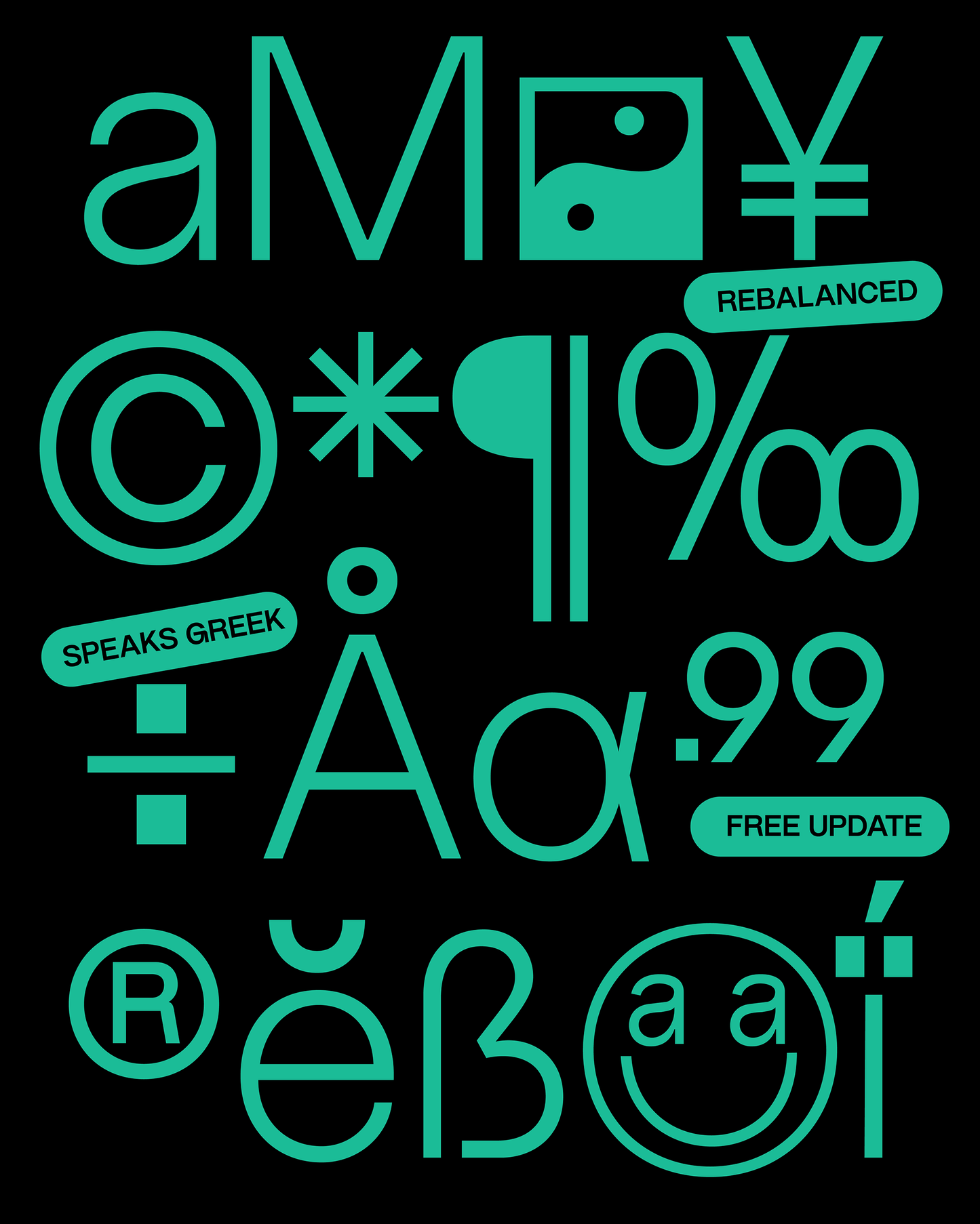
— 600+ glyphs
— 6 font weights + italics + monospaced
— Uppercase, lowercase, numerals, punctuation
— Diacritics
— Symbols
— Mathematical symbols (Roman numerals, fractions, signs)
— Western, Central, South and North Latin language support
— Latin Extended A (100%)
— Latin Extended B (13%)
— Greek


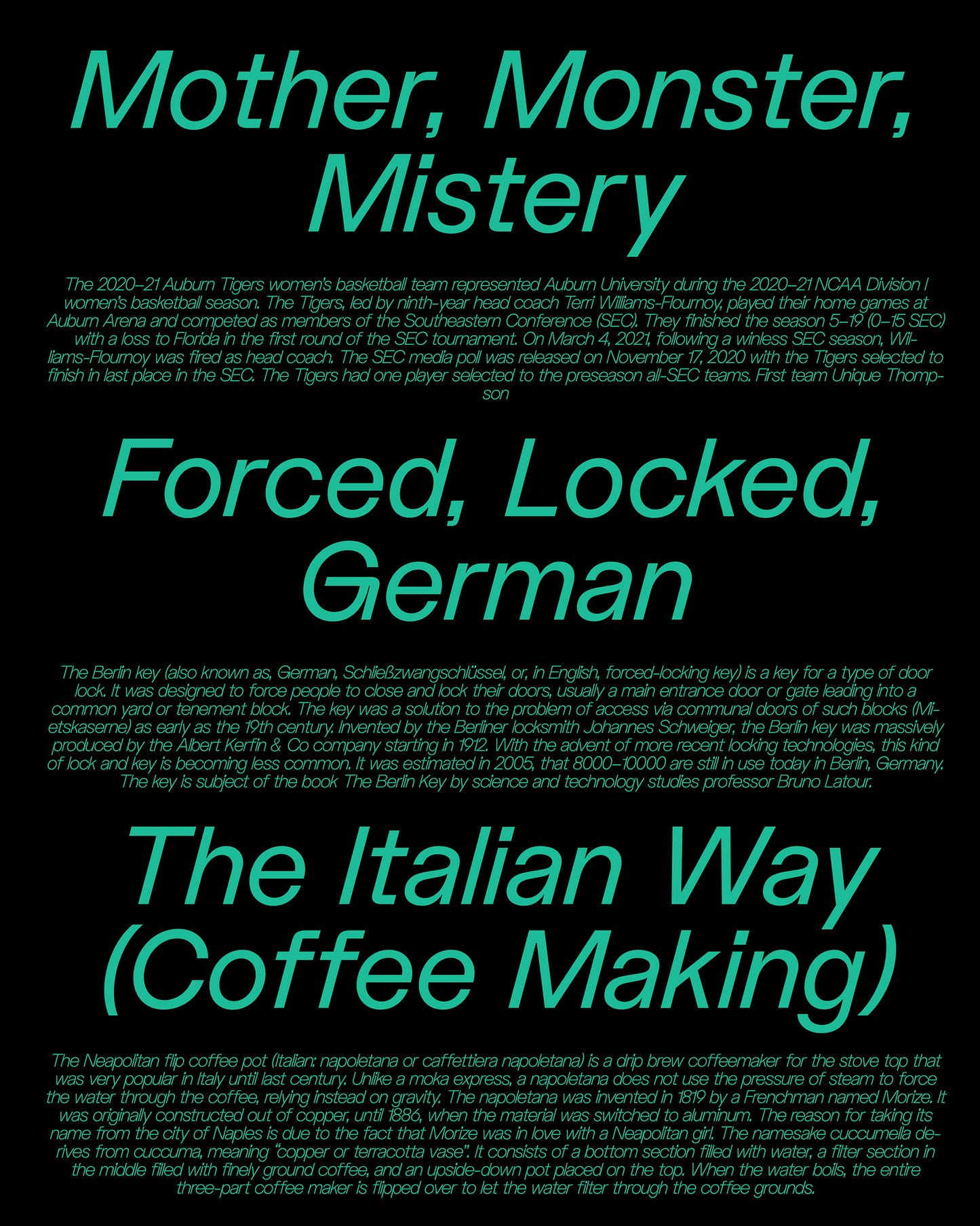
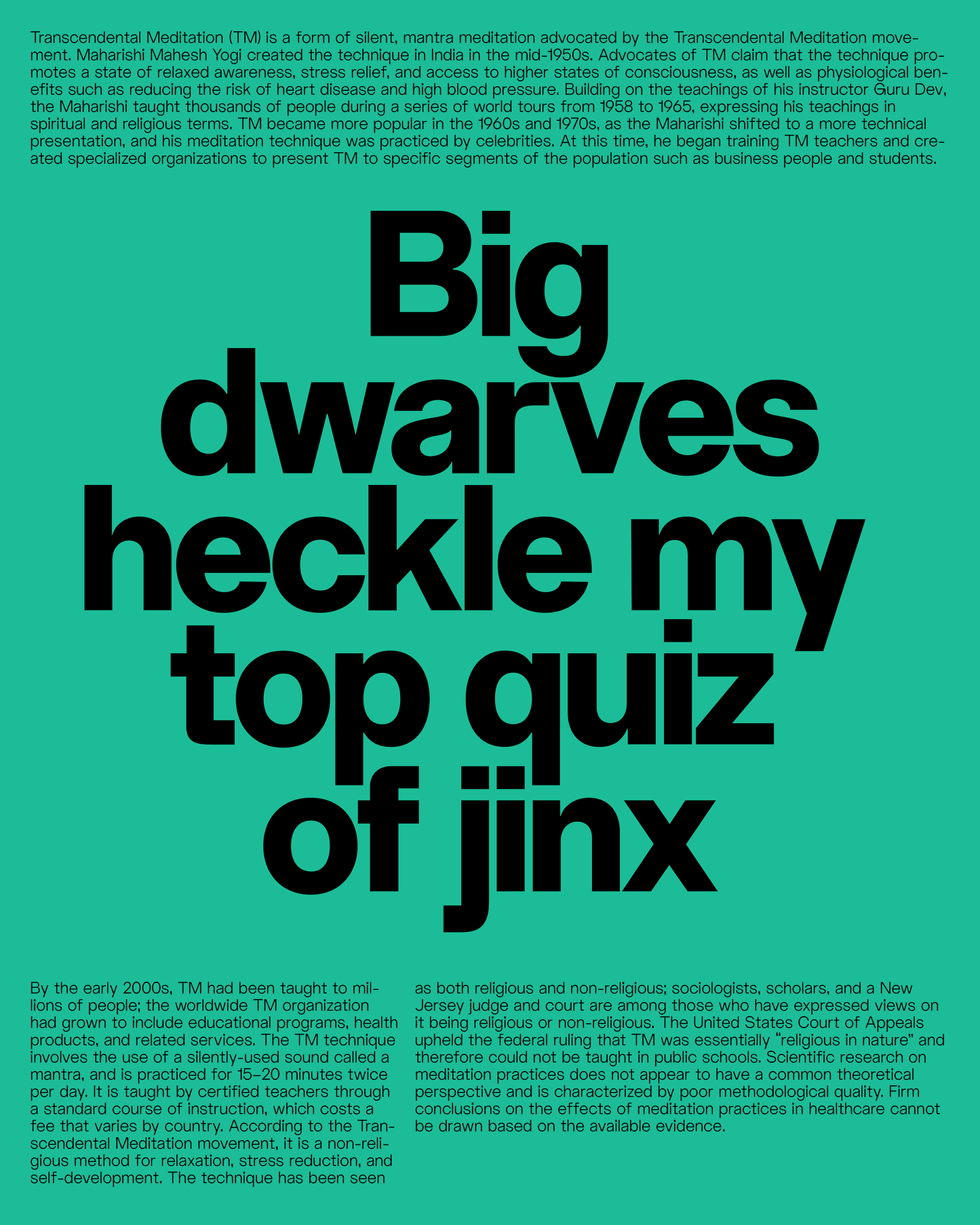
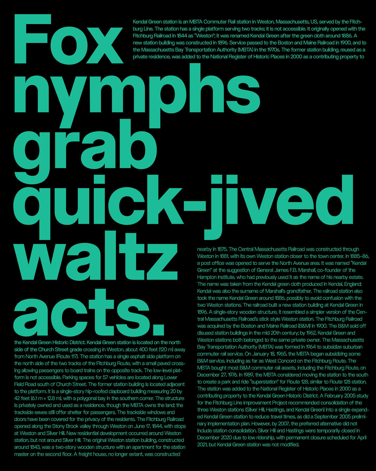
ALT Riviera in Use
We love seeing our fonts out in the wild, it is both a great way to keep an archive and to give back to the amazing designers creating great work. If you used one of our typefaces in a personal or commercial project, we'd love to see it. Send us an email with some images and a brief project description.
- Choosing a selection results in a full page refresh.
- Opens in a new window.